THOTCON 0xD Badge — Part 1: From Sketch to Early Prototype
We built the 2025 Thotcon 0xD badge. Here's our process.
TL;DR
I always start physical‐digital projects the same way I start a new game mechanic: pencil, paper, and a healthy disrespect for sunk costs. The THOTCON 0xD badge was no different. In this first post I’ll walk you through the messy front-end of my process—sketches, Bristol pad mock-ups, 3D‐printed "looks like" prototypes, and the decision to axe features that didn’t earn their keep.
1. Setting the Design North Star
For this year's badge, our constraint list was short but aggressive:
- Nostalgia, not novelty – feel more Tamagotchi than “cutting-edge IoT.”
- One-hand comfort – thumb-centric controls, a nice weight, and good hand-feel.
- Manufacturable at scale – Keep unit costs down (especially considering tariffs), low part complexity, reduce moving pieces.
As with any project, constraints help keep you honest in case an expensive or wild idea tries to sneak in.
2. Idea Dump: Pencil > Brainstorm > Repeat
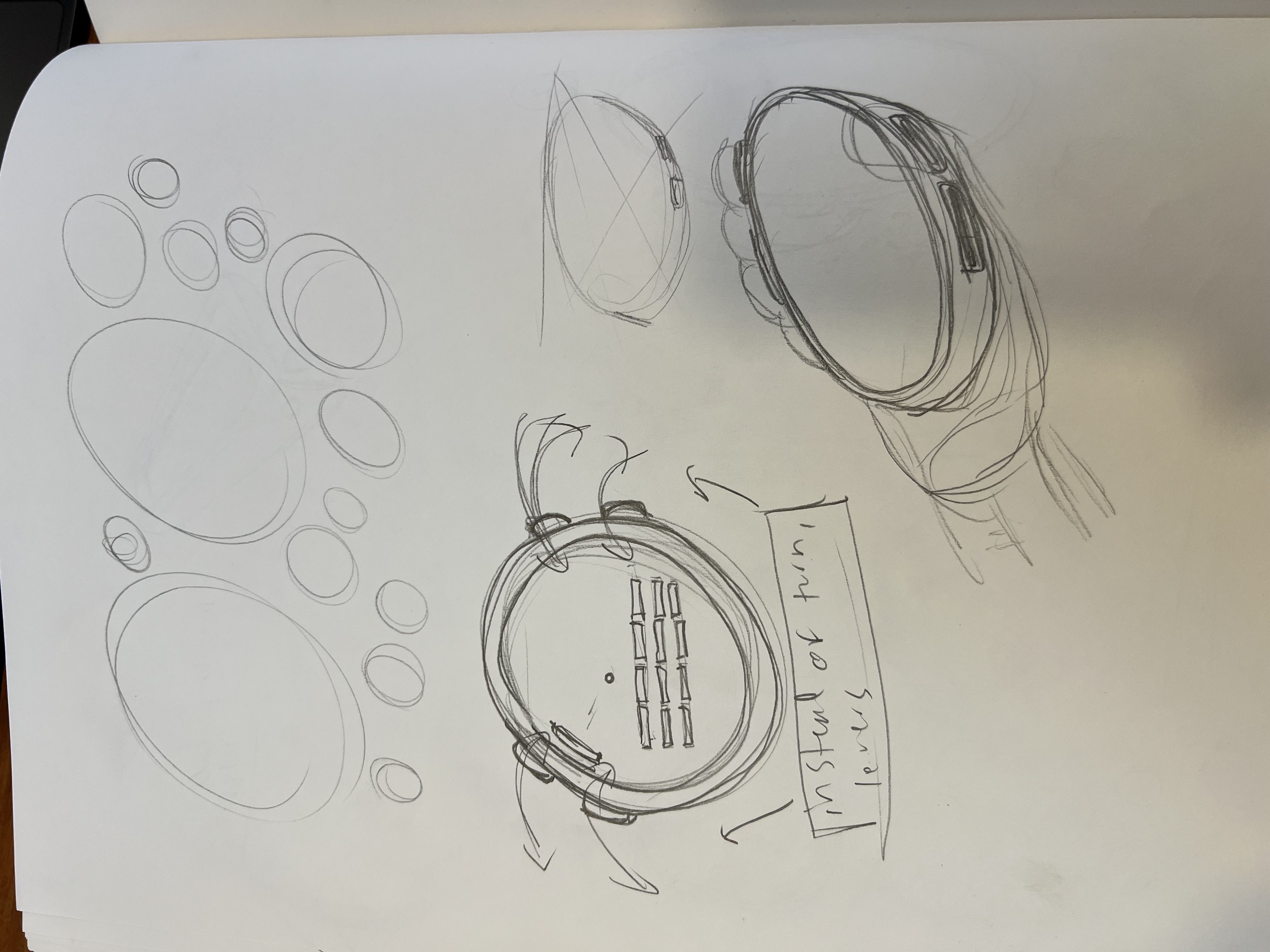
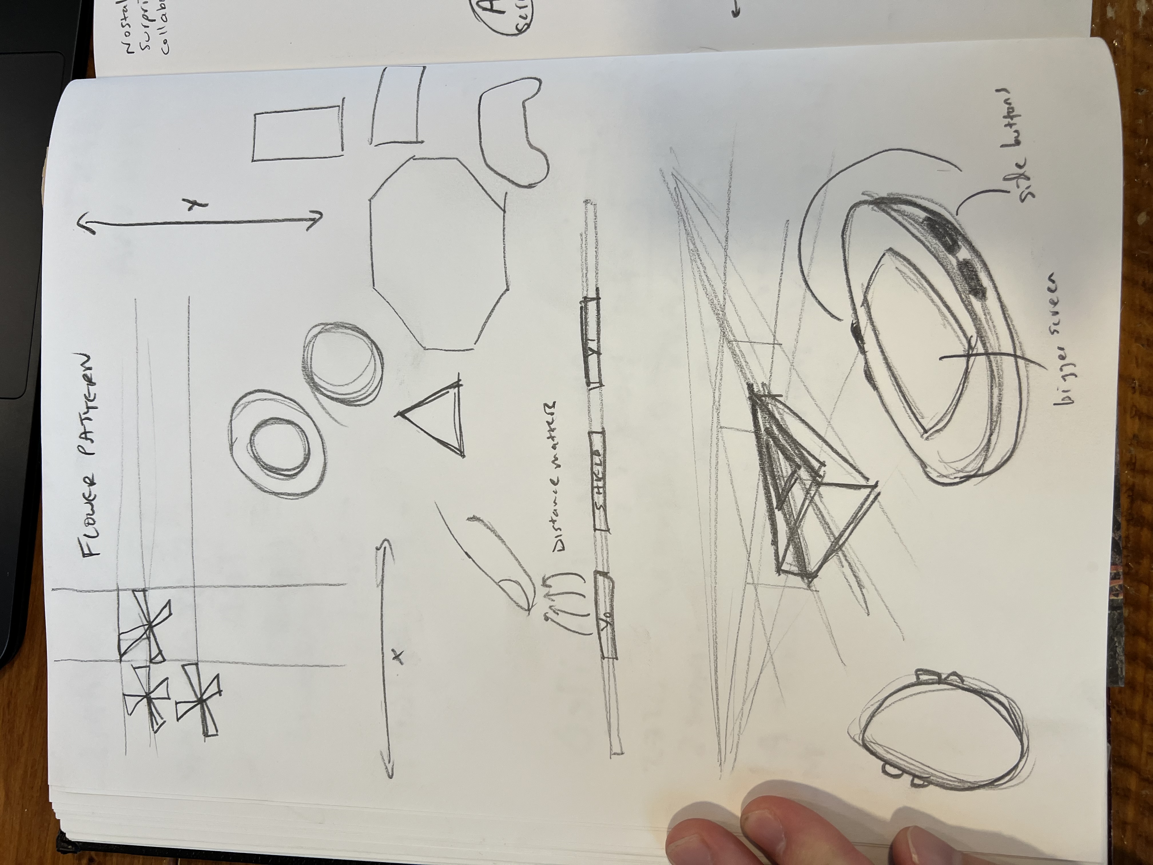
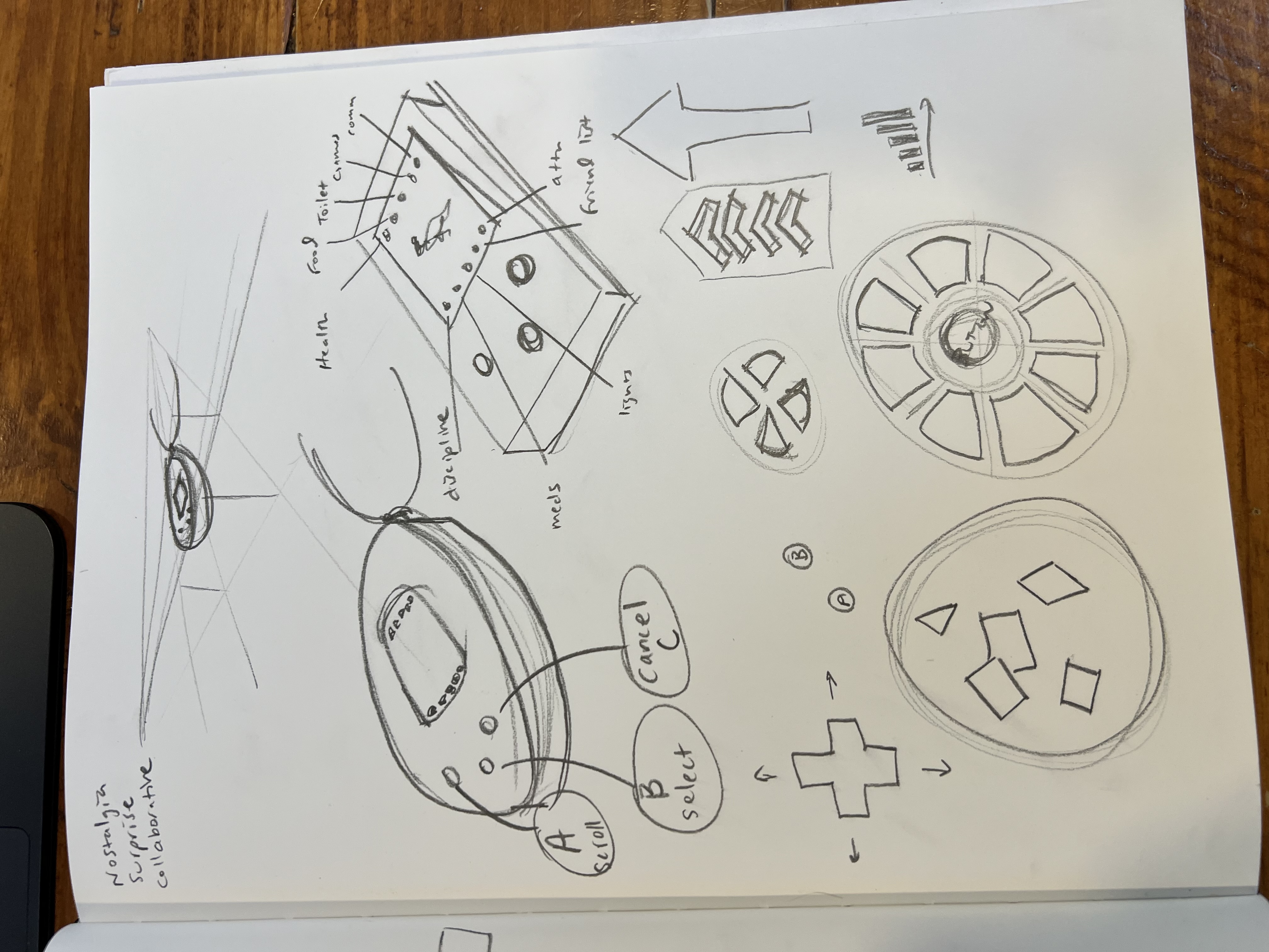
I burned through half a good bit of my sketch book riffing on interaction concepts:
- Flower-pattern XY pad – a 3×3 capacitive “bloom” that lets you swipe in two axes.
- Classic iPod wheel – haptic scroll ring with center-press confirmation.
- Slider strip – narrow capacitive ramp for analog-ish input.
- Tamago-egg shell – oval chassis that cues the pet metaphor.
None of these were precious; the goal was breadth.
3. 3D “Ugly” Prints: Failing Fast in PLA
PLA is brutally honest. I did all of the original work using Onshape (we later ended up switching over to Fusion once the PCB work began). I do my printing on a Prusa MK4. The prints told me:
- The ovoid shape was going to produce some problems with components placement. Most components are rectangular, and therefore to maximize surface area a rectangular container is optimal.
- The ovoid instantly screamed “digital critter,” but PCB real estate was tight.
- The side buttons were infeasible. Placing them on a PCB would be tricky at the price point we were aiming for.
Cheap filament, priceless feedback. The question I left this part of the process with: should we do a rectangle instead?
4. Benchmarking Real-World Devices
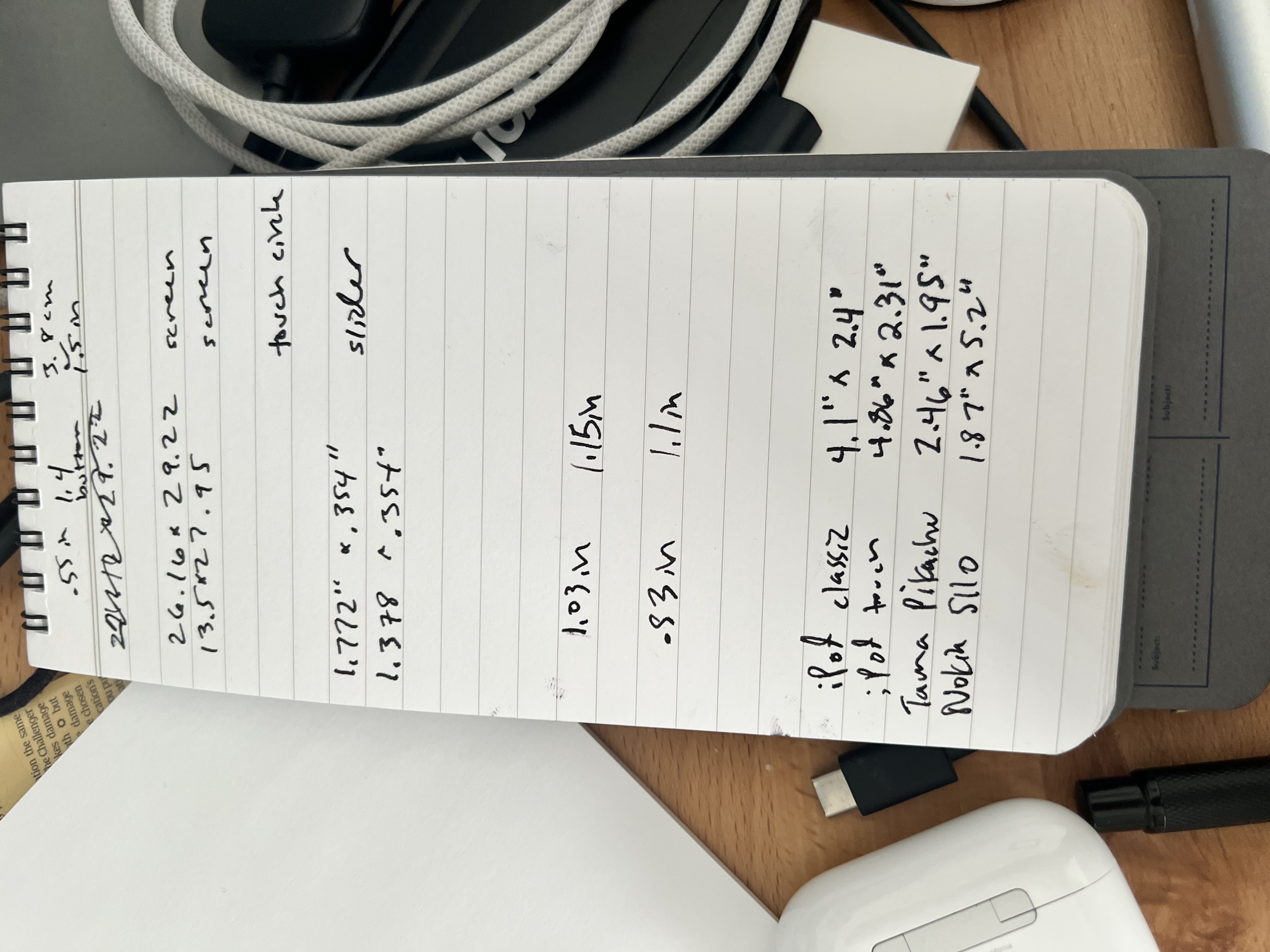
I got my calipers and measuring implements out:
| Device | W × H (in) | Why it matters |
|---|---|---|
| iPod Classic | 4.1 × 2.4 | Iconic wheel ergonomics |
| iPod Touch (gen 1) | 4.86 × 2.31 | Screen-to-body ratio |
| Tama Pikachu | 2.46 × 1.95 | “Pet-in-pocket” scale |
| Nokia 5110 | 1.87 × 5.2 | Indestructible thickness |
Those numbers ended up as cardstock rectangles and ovals I could shuffle on the table until a “that’s it” silhouette emerged.
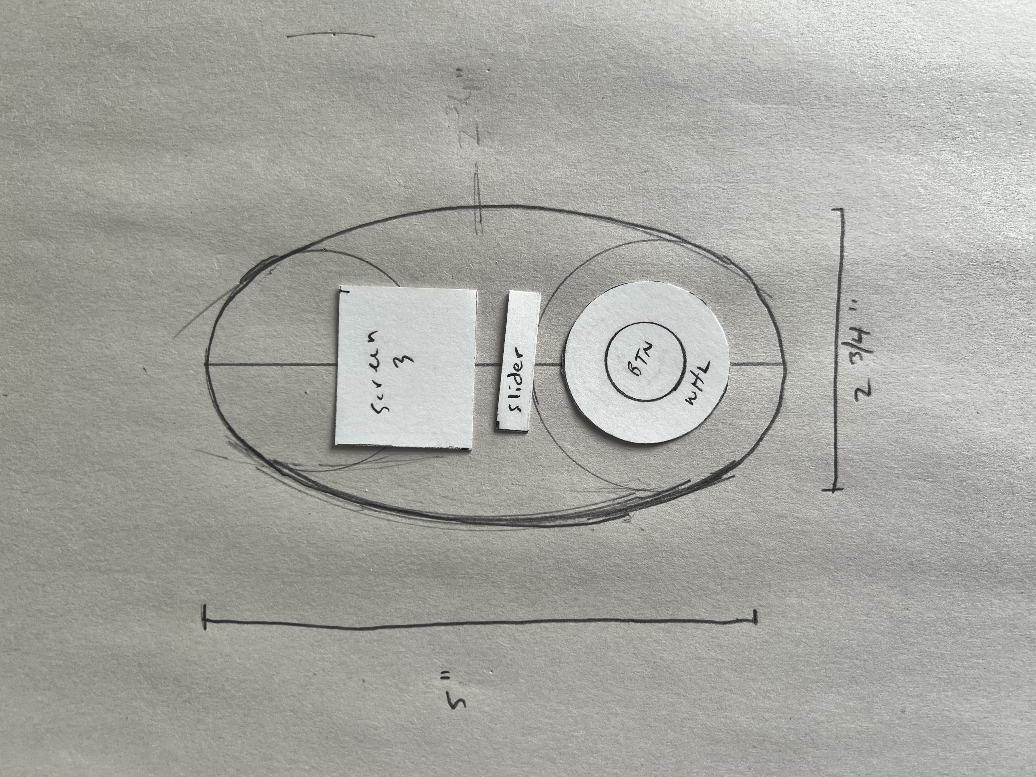
5. Paper Protos: Cheap, Quick, Honest
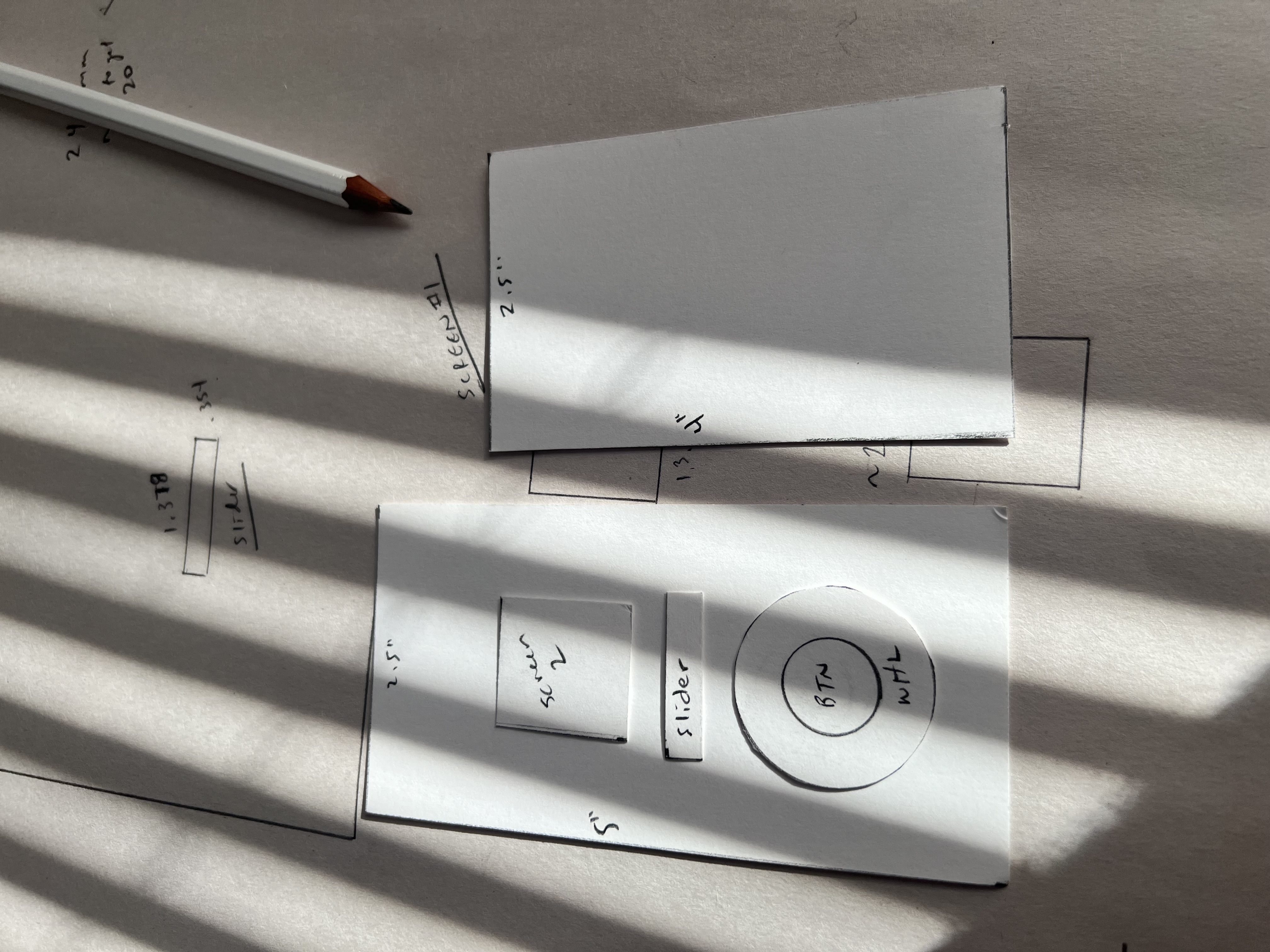
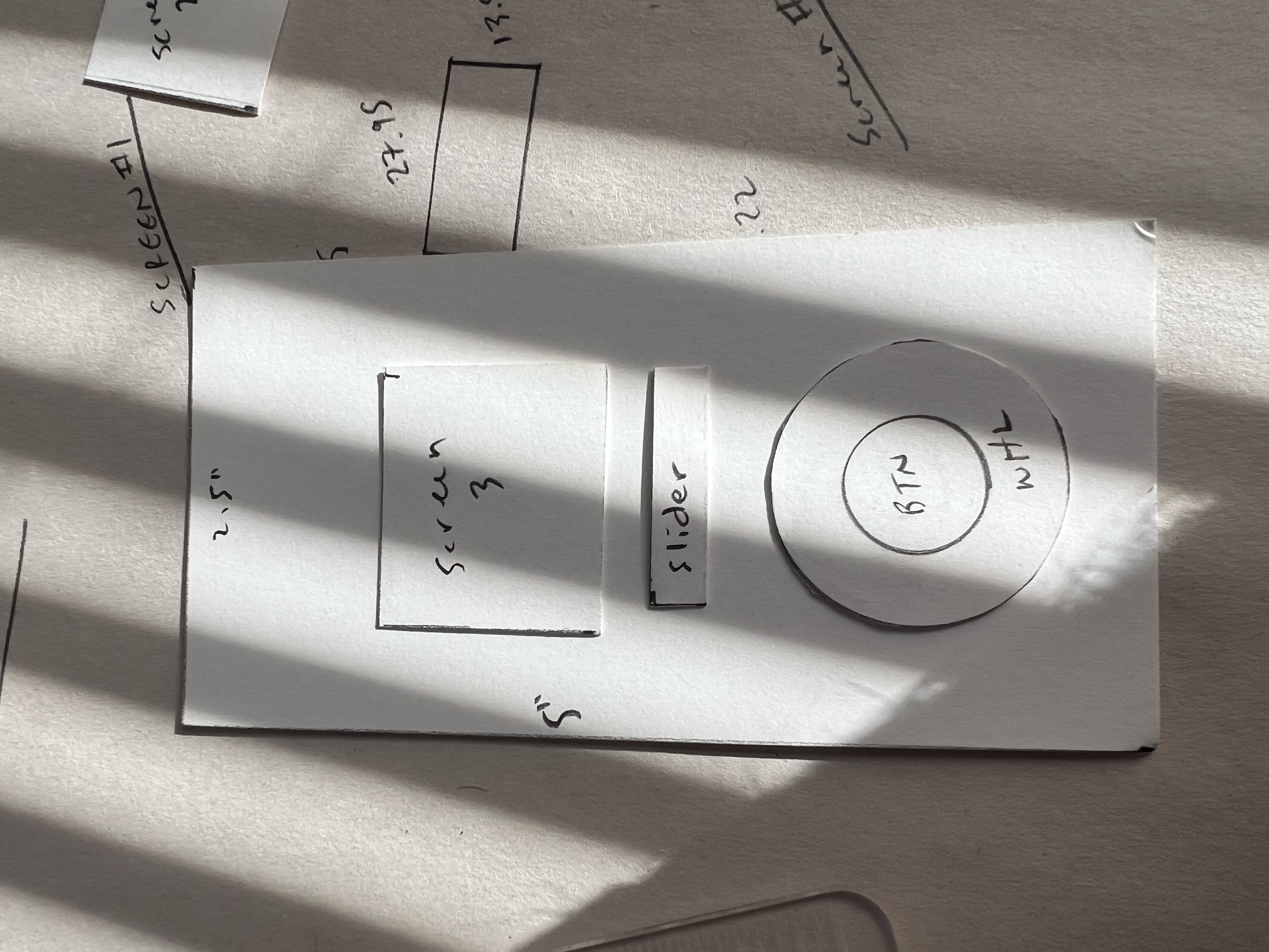
Cardboard doesn’t lie about pocketability. I use Strathmore Bristol 300 series paper for my paper prototyping because it has some nice rigidity to it. I mounted three screen sizes and two wheel diameters onto paper outlines and tried out different configurations. Two things surfaced:
- A 5" height was unnecessarily tall. All of the components could fit on something much shorter.
- Anything bigger than a ~2" screen was going to be difficult to place on the device. This was unfortunate, because I knew eventually it would affect readability.
Numbers locked.
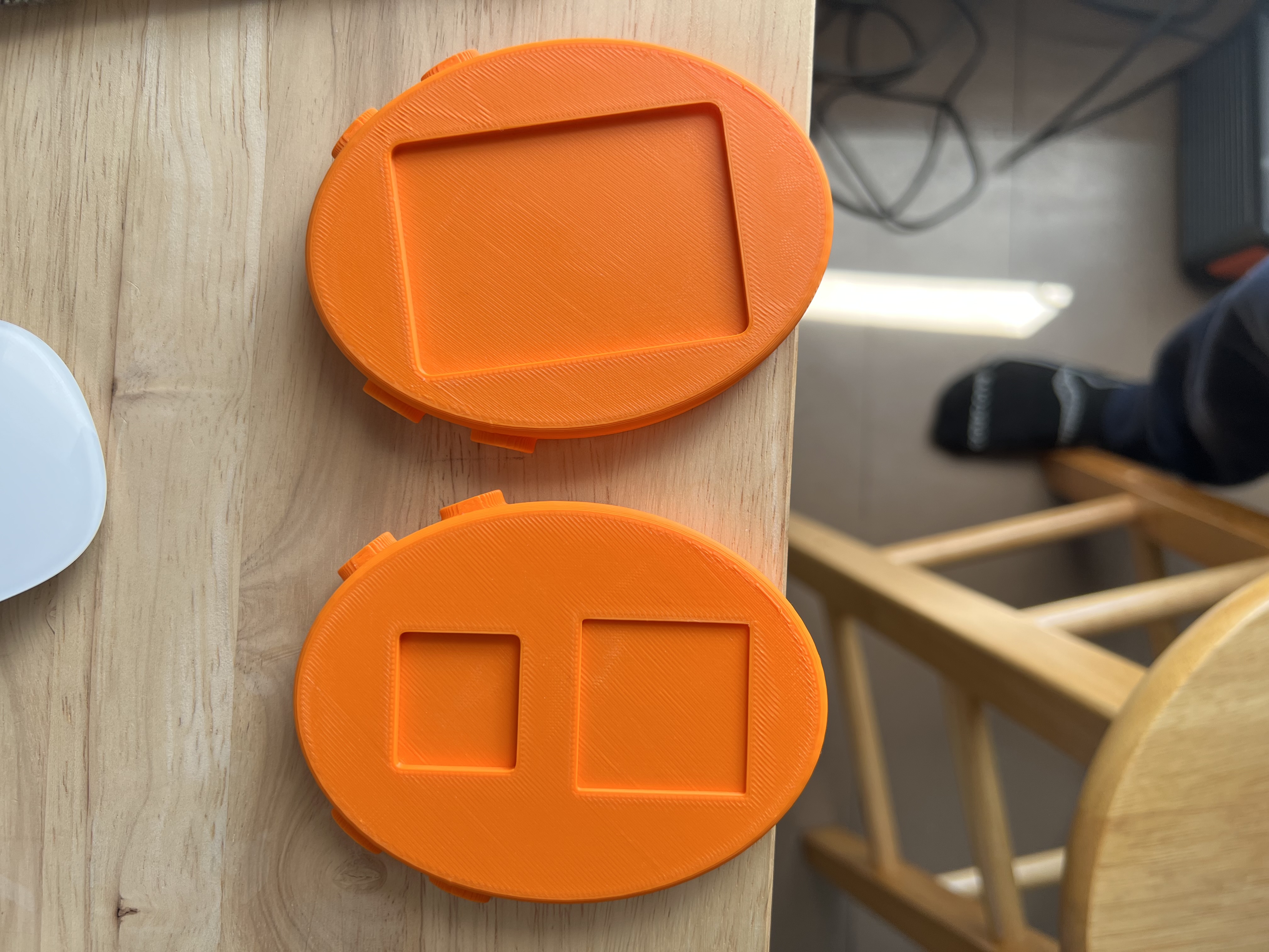
6. Laser-Cut Acrylic “Looks-Like” Models
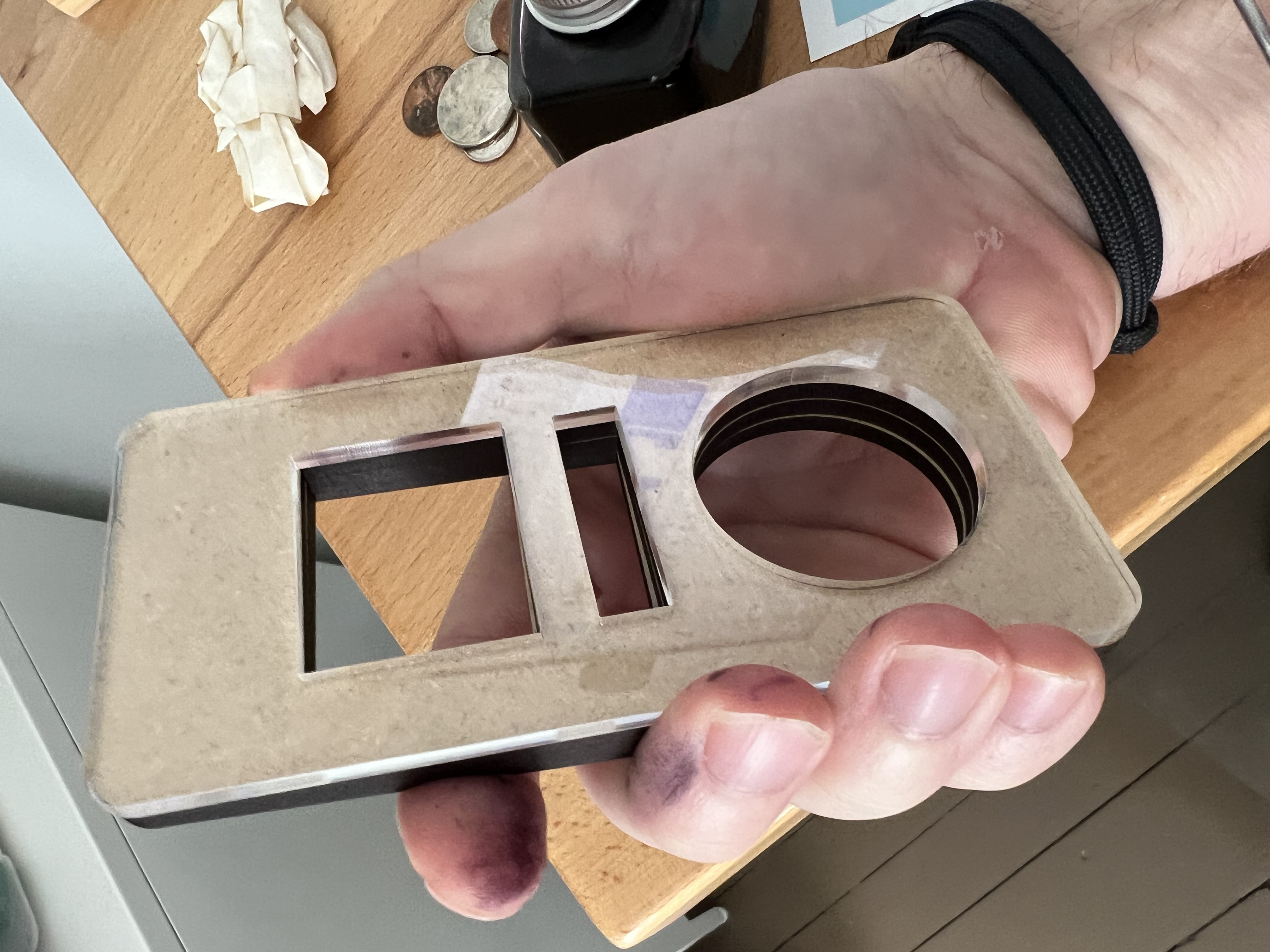
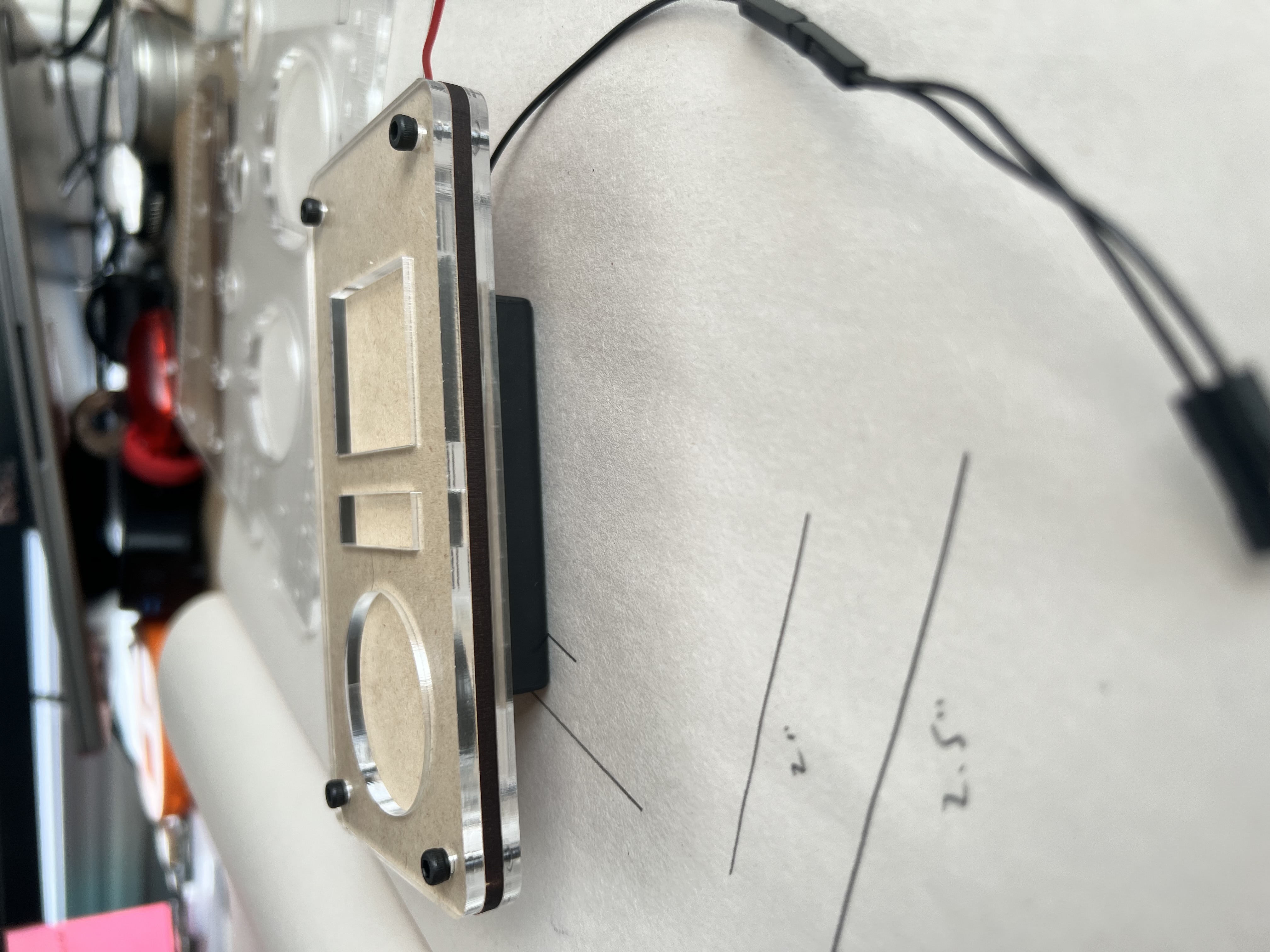
Once the form was > 90 % baked, I moved to stacked acrylic. I do my cutting on a Glowforge. OnShape has an option to export the faces of 3d objects as DXF files. This is handy because I can model something in 3D, print it, but also laser cut it. This came in handy when it came time to order the final acrylic shell for the badge:
- Three-layer sandwich – clear/black/clear to preview PCB + diffuser + lens.
- M3 standoffs to simulate actual screw posts. We ended up switch to M2.5 because the holes made during the PCB fab process are 2.5mm.
- Interchangeable inserts for wheel vs slider trials.
The see-through shell let me check hand feel, approximate weight, and component collisions without soldering a thing.
7. The Tough Cut: Farewell, Rectangle
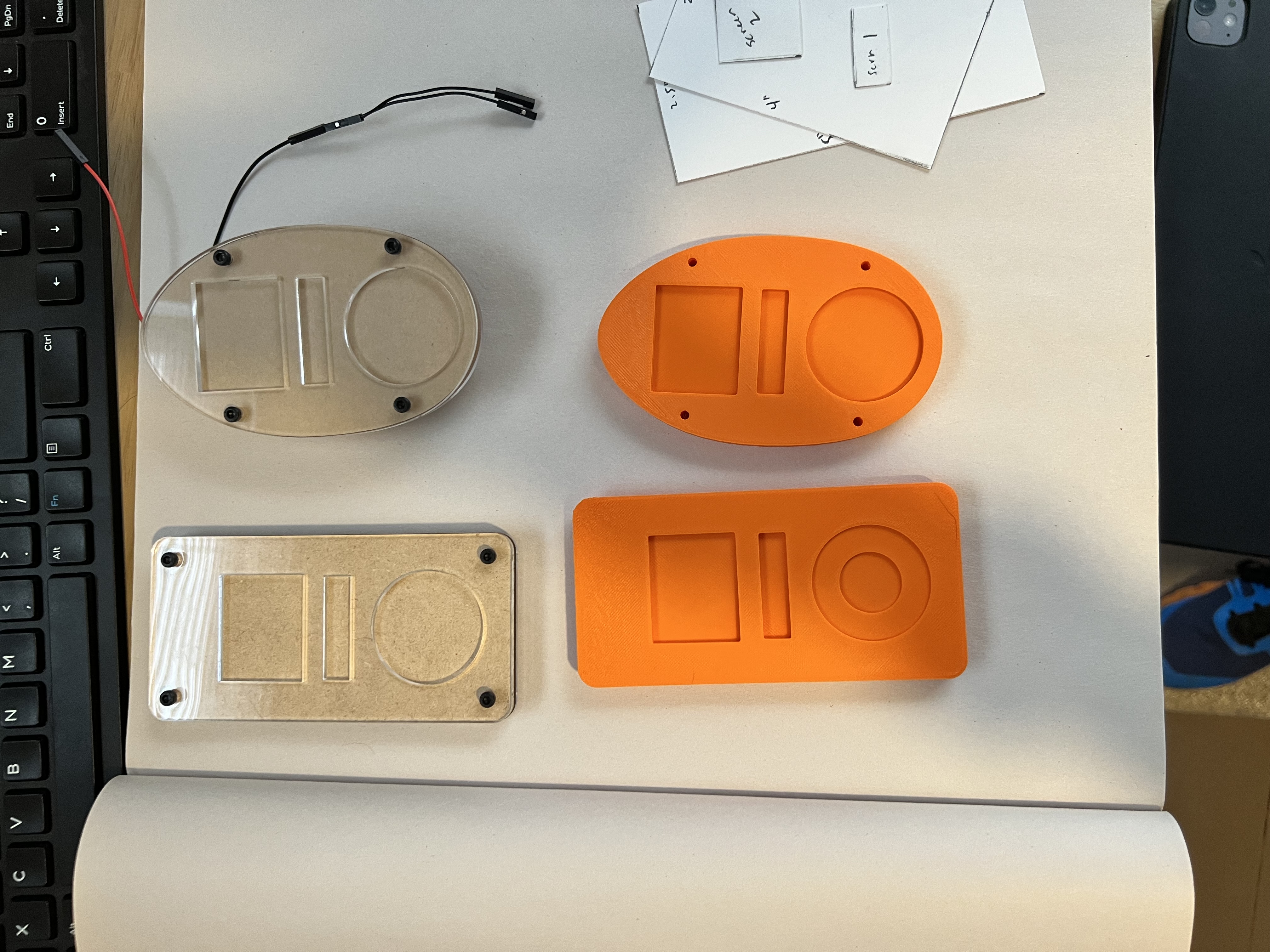
I loved the idea of rectangular shape, but aesthetic reality hit:
- The shape of the device implied its purpose. A rectangle, while sleek, did not imply the purpose we were aiming for.
- Going with the ovoid design was going to create all sorts of headaches -- from how to create the perfect shape, to having an ovoid sit in your hand nicely.
Shifting to the ovoid design, though difficult from a parts placement standpoint, ultimately leaned into the nostalgic aesthetic that we set out to adhere to.
8. Playtesting the Heritage
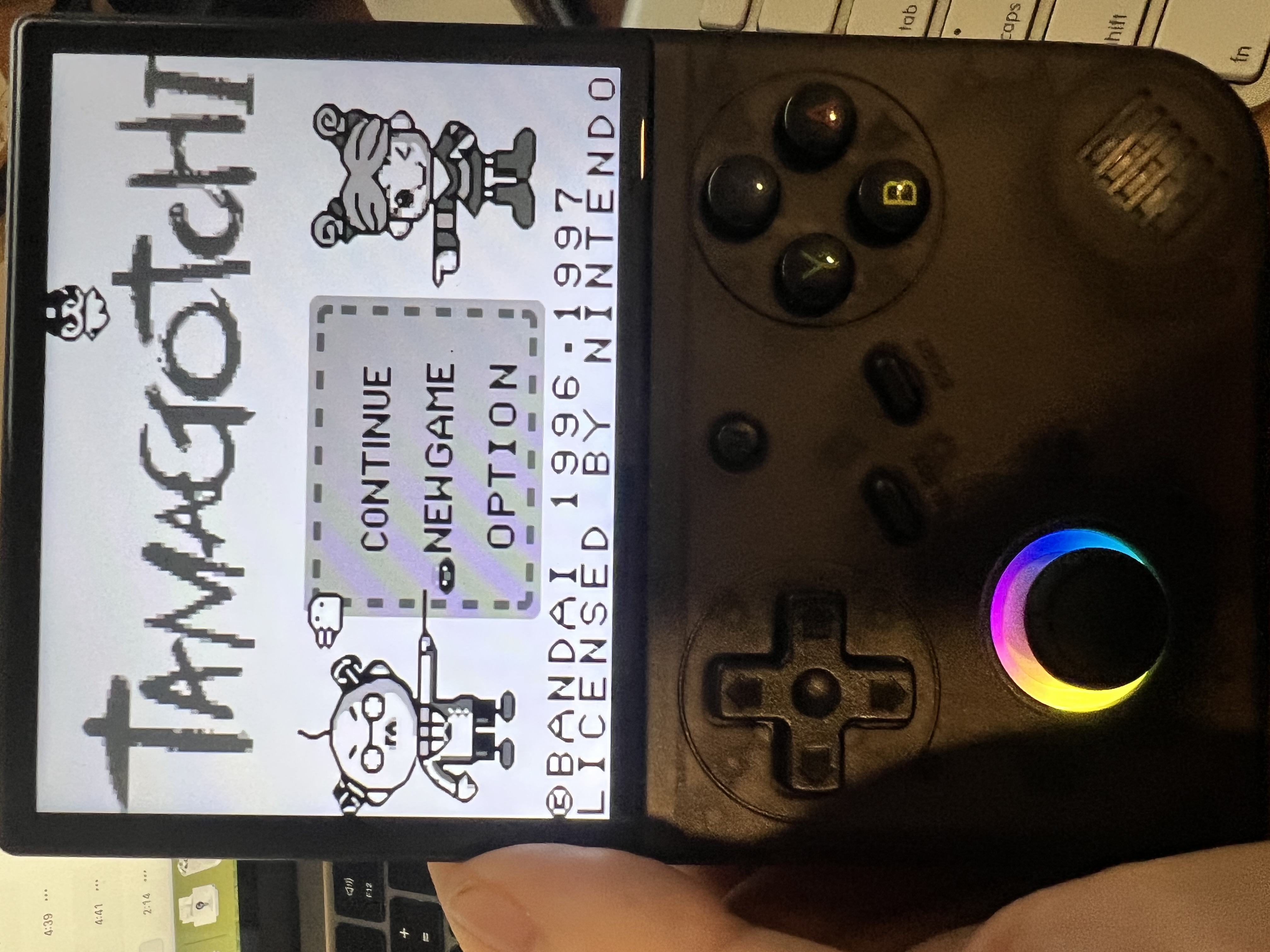
While hardware simmered, our team binge-played every virtual-pet I could flash. Some of the most informative ones:
- GB Tamagotchi for menu and interaction.
- Tama Pikachu for one-hand UX.
The exercise helped us begin to understand what hardware elements we needed to include on the badge and how people might interact with it.
Next up: dialing in the components, coming up with a schematic, rendering the final object, and getting parts quotes. Stay tuned for Part 2.
Want more?
- Ping me on
@jaymargalus(X) with questions. - Source files will drop on GitHub after the final post.
—Jay